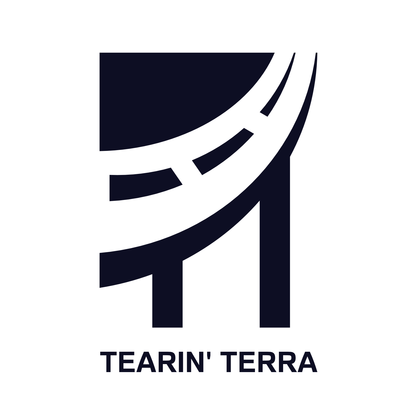
Tearin’ Terra Inc. is a Miami-based Civil Engineering company founded in 2019 with the purpose to serve the South Florida community by providing quality design services in the areas of transportation and roadway design.
The company aim to provide innovative approaches to solving engineering problems and strive to build long-term trust with their clients through the implementation of cost-effective project management while firmly adhering to safety standards and industry regulations.
The creative process for this brand came right through. Using the initials of the name ( TT ) as the pillars of a highway bridge was the perfect way to represent the essence of the company.
To complement the bridge, a red brick color was added to represent the touch with the ancient art of construction work and at the same time provide the idea of a beautiful sunset, iconic scenario in Florida. Altogether the imago-type provide a clean, harmonious and professional representation of the values of the company.
H: 240
S: 27
L: 12
H: 0
S: 0
L: 90
H: 359
S: 68
L: 45
By using this color combination the company will stand out of the competition as the use of colors like blue and green is abundant in this sector.
The red terracotta brings an eye catching point while the dark blue provides de seriousness and professionalism of the company, blending perfectly in front of a light blue background to provide some balance and visual calmness.
After a long search for the right font it came obvious that Familiar Pro was the right choice. A Sans Serif font with a more humanistic feel compare to Futura or the classic Helvetica. With this decision the company will keep the technically characteristically of engineering but without giving away the human touch that care for the community.
As a complement font we recommended the use of Helvetica Neue for specific text and digital documents in the case that Familiar Pro is not available.


