The Grafico is born out of the necessity of finding a design identity for my work and vision. The name is a mix of Spanish and English (Spanglish) to recall my roots and the cultural influence as a Cuban immigrant living in United States. The call for its creation is to be the creative bridge to represent the creative ideas of both cultures in a unique new way highlighting the best of both parts. The Grafico is a safe space to share and play with creativity outside the cultural norms and rules of design. A place where clients are changed for friends and collaborators. To work alongside the people that choose us and not for them. To make them feel as part of the process as possible and no just a result.
The difference of The Grafico is that we educate and involve our guests in the process in a warm and friendly manner typical of the latin culture without taking away the professionalism expected from the best design agency could deliver.
Heavily inspired by the Bauhaus and the simplicity of shapes and lines I started to work on reducing the unnecessary elements without loosing the intention of the concept. After dozens and dozens of sketches playing with the “g” I decided to keep this design that is both, a logo and a monogram (depending of the viewer).
H: 30
S: 5
L: 8
C: 72
M: 68
Y: 67
K: 88
H: 32
S: 87
L: 94
C: 0
M: 5
Y: 10
K: 0

The color decision is based in two colors to preserve the simplicity of the design. The focus of the color decision is to give the feel of an old document to transmit a feel of warmth, longevity, and closeness like an old letter.
Even though that black is the main color of choice for details and content the light beige is the real protagonist. This tone of beige helps to relax the eyes of the blue light on digital media giving a friendly sensation to the viewers. On prints gives warmth to negative spaces otherwise filled by a cold sterile with.

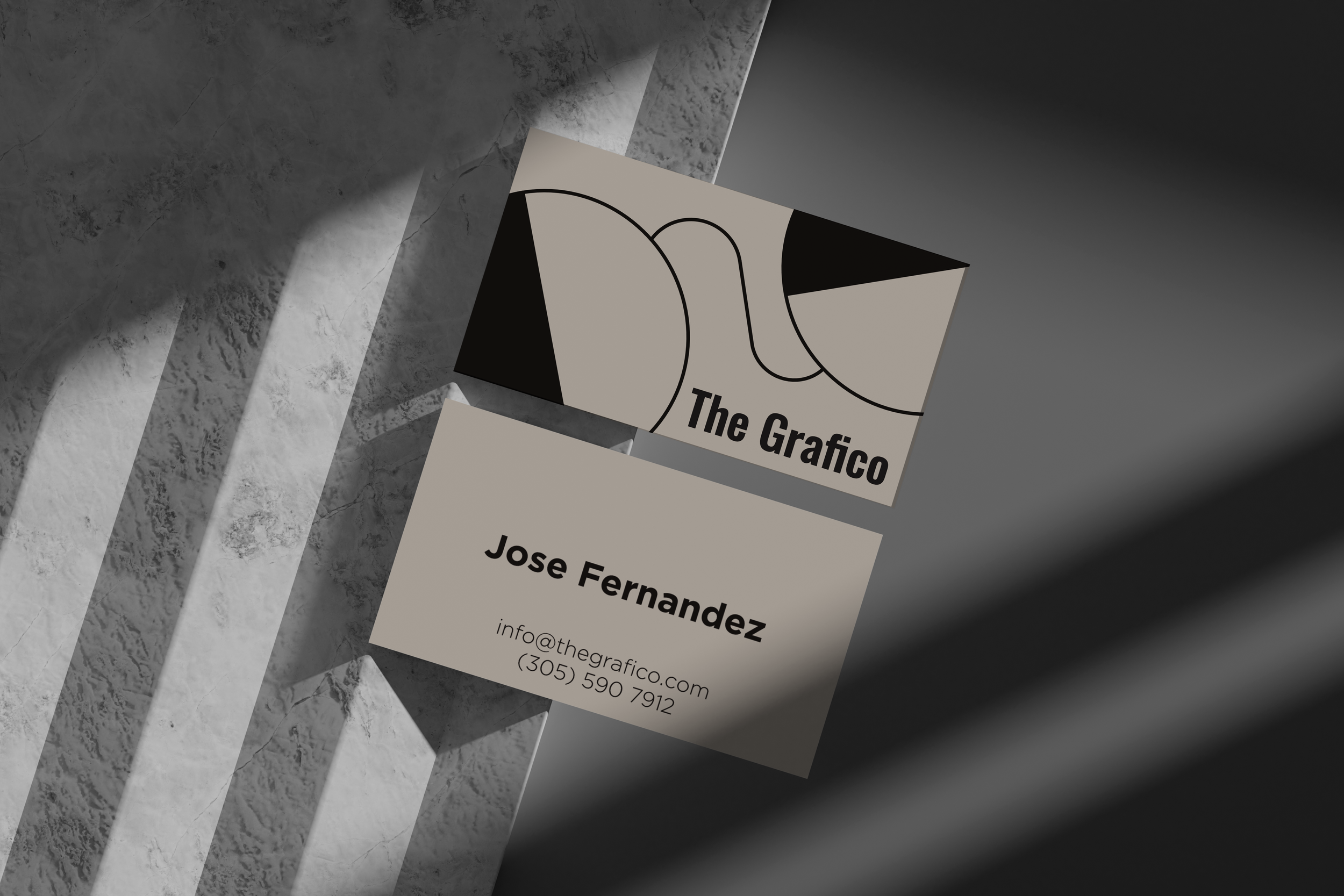

After evolving a lot looking for a font that feels personal but yet one that ages with elegance, Gotham was ringing constantly in the lists. Ideally this was the principal font for the brand, a font that is technical, familiar by everyone regardless of their knowledge of design. With time and because the extensive use of Gotham in everyday design we decided that Oswald is a better option. This font is more humanistic and feels natural with the name, design and values of the brand. (I specially love the ligature of the “fi” in Grafico). Both fonts complement each other seamlessly alternating the geometric shapes of Gotham and the hand touch of Oswald, without sacrificing the usability in all formats (specially digital).
